Update June 2017: ArcGIS Maps for Power BI is out of “Preview”
Recently, Microsoft and Esri teamed up to create “ArcGIS Maps for Power BI”. Here at DVG, we specialize in both GIS and Business Intelligence, so we decided to “kick the tires” to explore the possibilities. ArcGIS Maps is currently in “preview”, so you have to enable it in File > Options > Preview Features > ArcGIS Maps for Power BI.
In Power BI Desktop, the first thing that jumped out at me was the ease of translating raw data into geo-located data. Just click the Esri globe visualization (see figure below, it’s selected) to add the ArcGIS Maps visualization to the canvas. Then, just drag your address field into the “Location” data well. ArcGIS Maps automatically geocodes the addresses, and drops them on the map. The addresses must be in “single line” format (e.g. 123 Main Street, Happy Valley, NY). The newly mapped address locations can now be symbolized by size and color, heat mapped, and analyzed.
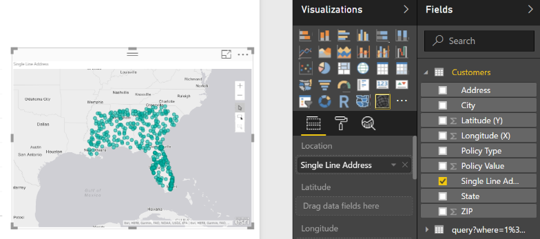
Figure 1. Example of geocoding single line addresses using ArcGIS Maps visualization. Addresses are dropped into the “Location” well and added to the map.
Selecting Data
After data are mapped, there are variety of different ways to select those data. In addition to selecting individual points, the multi-select tool can be used to select many points that are within proximity to one another by dragging a box on the map. The third method is to use “reference layers” (more on this below) to select data that fall within geographic boundaries. The ability to select data based on proximity, as opposed to shared values, adds a valuable capability to Power BI.
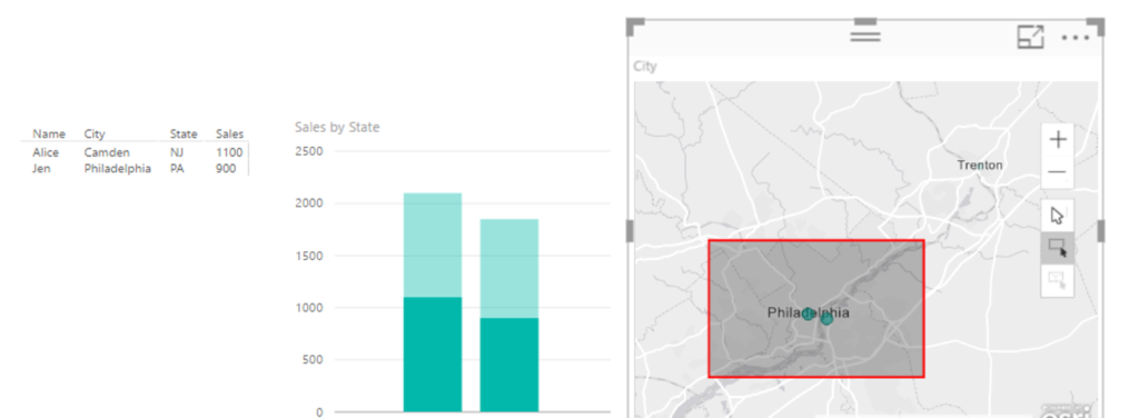
Figure 2. ArcGIS Maps adds the capability to select based on proximity. The red box selects data in Philadelphia and Camden, which are in different states. The bar plots on the left are cross highlighted to show the selection.
Reference Layers
Adding reference layers is one of the most powerful features of ArcGIS Maps because it enables users to leverage Esri demographic data as well as layers from ArcGIS Online (AGO), which is a powerful cloud based SaaS geographic information system (GIS). The Esri demographic data layers are produced by Esri and include layers such as age, income, diversity, and population. These demographics are organized into U.S. Census statistical areas (i.e. cities, counties, etc.). For AGO layers, you can run a search to get the data you are interested in, for example, state or county boundaries. AGO layers include Esri data as well as data from your (or your client’s) own AGO account. (Here’s a tip, when publishing a layer in AGO use descriptive “tags”, and then use the tags to search for your layer since AGO search does better on tags than layer name.) Having access to demographic and AGO layers provides a highly valuable integration point for organizations who are already invested in Esri products.
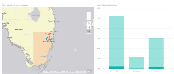
Figure 3. Map showing Esri reference layer “population density”, which is selected by the area surrounding Miami, FL.
GIS Web Services
Since DVG does a lot of web development, we routinely publish and use geographic web services. There are variety of standards for geographic web services/formats, but I will focus on a very popular standardized format known as GeoJSON (RFC7946). According the the spec, GeoJSON is
GeoJSON is a geospatial data interchange format based on JavaScript
Object Notation (JSON).  It defines several types of JSON objects and
the manner in which they are combined to represent data about
geographic features, their properties, and their spatial extents.
I wanted to see if I could consume some GeoJSON and put it on an ArcGIS Map. So, I grabbed all the locations of Big Belly waste baskets in Philadelphia (from OpenDataPhilly) through a web request (REST) for GeoJSON. After receiving the data, I used the Power BI query editor to expand and format the GeoJSON (see below), which didn’t take long. Then, I just added the Latitude and Longitude fields to the ArcGIS Map, and the points were on the map! I also used this to consume Esri JSON from ArcGIS Server, with the same amount of effort (not shown). Bottom line, I can easily turn Power BI into a GIS dashboard that integrates with existing GIS web services.
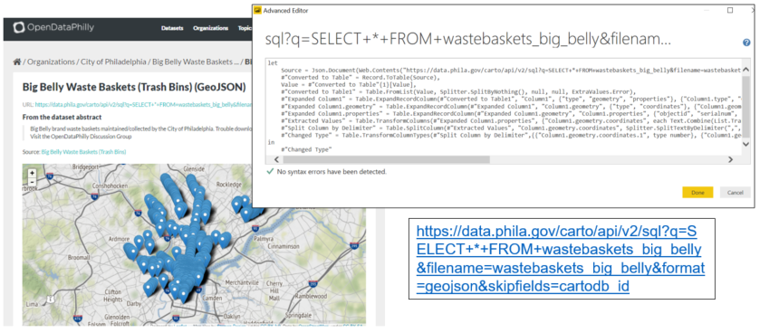
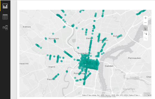
Figure 4. Big Belly waste baskets in Philadelphia in Power BI, imported from GeoJSON REST endpoint
Takeaways & Limits
ArcGIS Maps is a powerful feature that clearly adds value to Power BI. There are many more features than what I discussed in this post including time aware maps, drive time analysis, Infographics, map pins, and heatmaps. Service limits for ArcGIS Maps include:
- Maximum of 1,500 address geocodes
- Maximum of 10,000 administrative geocodes (e.g. state, zip, county, etc.)
- Maximum of 30,000 points using the “Latitude” and “Longitude” field wells
- Maximum of 30 minutes for the drive time analysis
- Maximum of 1,024 data columns
Going forward, we are expecting that ArcGIS Maps will soon be out of Preview, and hoping that users will be able to add private/secure content from their AGO Organization (via OAuth 2.0 authentication). The combination of the two technologies is a great fit, and the sky is the limit for creating geospatial dashboards (possibly in real-time).


